
The Difference Between Good-Looking Design and Good UX
A lot of design studios produce work that looks impressive in a portfolio — clean layouts, beautiful colour palettes, smooth animations. Then companies hire them and discover that the designs, while visually polished, don't actually solve the right problems. Users get confused, drop off, or ignore core features because the design wasn't built around how people actually think and behave.
Good UI/UX design is not primarily about aesthetics. It's about understanding user goals, removing friction from the path to those goals, and making complex things feel simple. The visual layer matters — ugly interfaces erode trust — but it's the outcome of a research and thinking process, not the starting point.
What a Strong UI/UX Design Process Looks Like
User Research First
Strong UX teams start by understanding users — who they are, what they're trying to accomplish, where they currently struggle. This might be user interviews, usability testing on an existing product, analysis of support tickets and analytics, or competitive benchmarking. The point is to make design decisions based on evidence about real users, not assumptions.
If a design company goes straight to Figma without asking about your users, treat that as a warning sign. Beautiful designs built on assumptions about users fail in ways that are expensive to fix.
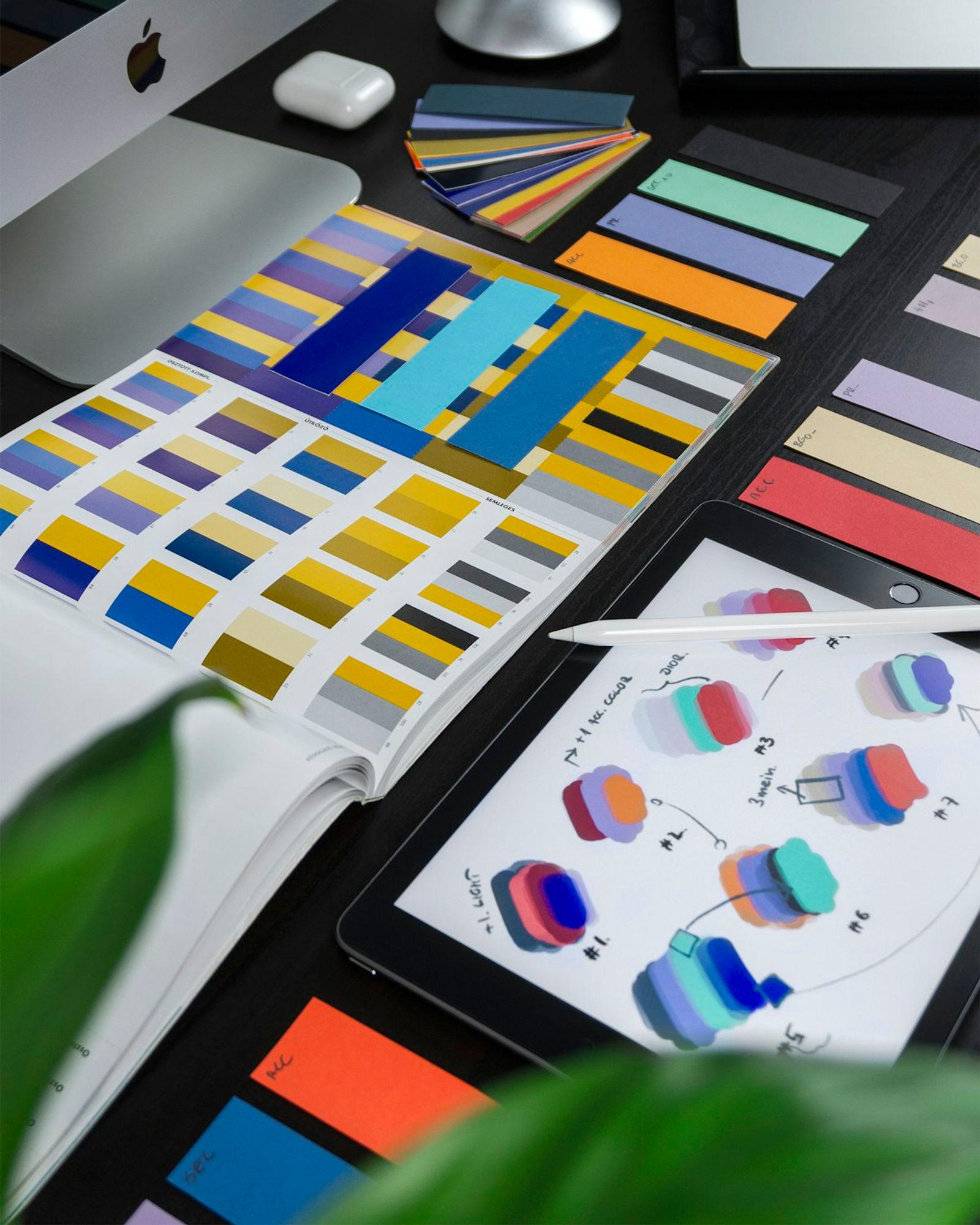
Information Architecture Before Visual Design
Before thinking about colours, typography, or visual style, good UX designers work on information architecture — how content and features are organised, what the navigation structure looks like, how users move through the product. This is invisible in the final design but determines whether the product makes sense to use.
Wireframes and Prototypes Before High-Fidelity
Good design teams produce low-fidelity wireframes before high-fidelity designs. Wireframes are fast to create and fast to change — they're for testing structure and flow without getting distracted by visual details. Jumping straight to polished high-fidelity designs is a sign that a studio prioritises looking impressive over solving problems.
Iterative Testing
The best design teams put prototypes in front of real users and watch what happens. Where do users hesitate? What do they ignore? What confuses them? This feedback shapes the next iteration. Design teams that never test with real users are guessing, regardless of how experienced they are.
How to Evaluate a UI/UX Design Portfolio
- Ask for case studies, not just final screens — you want to understand the problem they were solving, not just see the output
- Look for evidence of research and iteration, not just beautiful end states
- Ask what metrics changed after the design was implemented — good designers care about outcomes
- Check if their portfolio shows work across different types of products, not just marketing sites
UI/UX Design Costs in India (2026)
- Landing page / simple website design: ₹50,000–2 lakhs
- Mobile app design (full screens): ₹2–8 lakhs
- Web application or SaaS product design: ₹5–20 lakhs
- Full design system: ₹8–25 lakhs
Design and Development Together
One common failure mode: hiring a design company and a development company separately, then discovering they produce work that doesn't connect cleanly. Figma designs that look great but aren't buildable. Developer handoffs that lose the nuance of the design. Components that don't match between the design system and the codebase.
At Dharmsy, design and development happen together — our designers work alongside developers, which means what gets designed can actually be built, and what gets built matches what was designed. If you're planning a product and want design and development handled by one team, get in touch.